


It only takes a few seconds to get a first impression of a website. There are almost two billion websites currently in use, so it’s crucial to make that impression a lasting one.
Product pages are without a doubt one of the most important pages for an ecommerce site, as they’re the only page with product details and benefits. Particular focus and care needs to be placed on the design, to make a website appealing and easy to use. Here, we’ll cover a few examples and tips of well designed product details pages.
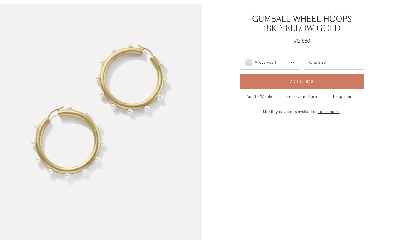
Choose the Right Images
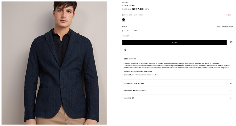
Every product needs to look its best. Avoid blurry images with overlapping technical text. Clear, high quality images that are in line with your brand help drive sales. Allow the user to zoom in on the images and give a wide selection of reviews, proportion references, details, etc.
In the example below, Falconieri features large, high resolution images that coincide with the product details, making the images a prominent element of the design.
Make the Call to Action Stand Out
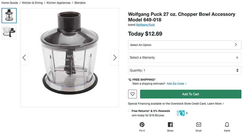
The “Add to Cart” button is the most pivotal element of the product page. It’s where you make a purchase, so it must be recognizable. Use bold colors and make sure it stands out. You don’t want your Add to Cart button to be identical to your Add to Wishlist button!
Overstock uses a solid green Add to Cart button, which is easily distinguishable from the rest of the page. The “Select an Option” drop down element is completely different from the Add to Cart button, for example. Notice how the other links, like the Wolfgang Puck brand name, and the zip code option to determine shipping are so different from everything else; their text is just highlighted in blue.
Include Relevant Information
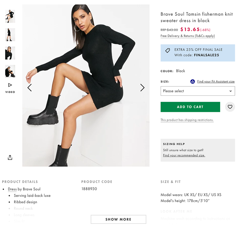
The most relevant information for your product needs to be visible above the fold. Anything else can be below the fold, preventing visual clutter and keeping the focus on key information. Asos’ product page shows a huge amount of relevant information, but it never feels cluttered, and they utilize links to include any additional information, like shipping restriction information, or size assistance. The most relevant information is easily accessible, like the price of the garment, what it looks like, and the option to add to cart. Less relevant information is included below the fold, like purchasing suggestions, accessory options, and reviews.
Easy to Use Navigation
No one wants to search for shipping options. Adding elements like breadcrumbs (navigation that shows a user their location, and how they got there), makes navigation easy.
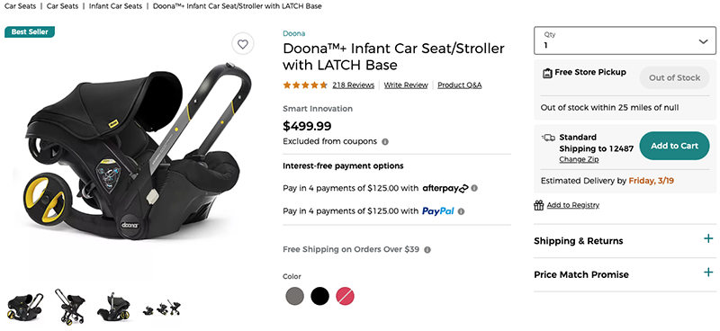
BuybuyBaby’s breadcrumbs include product information, the complete product name, payment instructions, shipping information and details, pick up options, and product Q & A. No one ever needs to search for information because everything is all in one place. If someone has to constantly open new pages and searches to find information about a product, they won’t stay on your website. A lack of information can be frustrating. Online shopping is supposed to be easier than looking for something in person.
Make Your Page Flow
The design structure of a page needs to flow in a sensical manner. If you’re reading a news article, the article headline is first, followed by the author’s byline, and then the article itself. It would confuse anyone to change the order. No one would ever know what they’re reading! It’s the same for a product page.
Irene Neuwirth’s online shop groups together all of the basic elements. They follow a very simple structure in the example above.
1. What is this? 2. How much is it? 3. Which one do I want? 4. I’m buying it!
The easier it is to purchase something, the more likely someone will make a purchase.
Error Handling
Error handling is a crucial element in every design interface. For example, if a shopper receives an error because they forgot to select their shipping method, the corresponding error should be obvious.
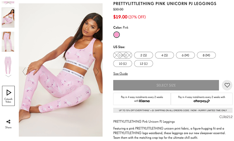
Pretty Little Thing won’t even allow someone to add an item to their cart until they select a size. But once a size is selected, the add to cart option is immediately available. It may seem like that’s an unnecessary step, but imagine going through trying to purchase an item, only to find out as you’re paying for it, that you forgot to include something, and now, you have to start all over again. Do you really want to start the process again?
Make Your Design Count
With the current influx of websites, it’s key to capture a customer’s attention with your design choices. Every design element needs to be considered to give someone the best possible experience. It takes seconds for someone to decide whether they want to continue to look at your website. At Curious Minds, we make those seconds count. Contact us today to see what we can do for you.