


Designing a form that is both visually appealing and functional can be challenging. Whether it’s a contact form or a job application, there are a few rules to follow in order to avoid frustration. A clean, uncluttered design with well-defined elements is key. The elements creating a functional, accessible form are the layout, labels and placeholders, and CTA’s.
Designing a Clutter-free Layout
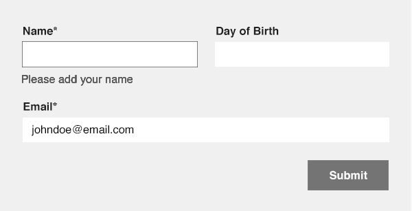
A defined and clean layout, with correct spacing and proportions, helps users navigate through the form. Particular attention should be put into creating a clean layout, which avoids confusion. Cluttered inputs without proper spacing are hard to read and interpret. It also doesn’t leave much space for important elements, like error messages and labels. In the example below, note how the lack of proper padding and spacing makes the form look messy. It’s hard to tell which label corresponds to which input, which may discourage someone from using a form, especially on mobile devices.
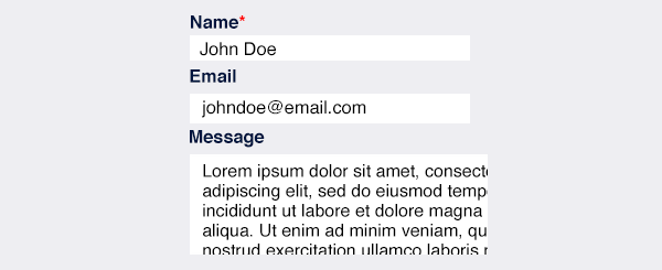
When it comes to long forms, it’s important to create semantic groups to allow the user to visually associate inputs with the same topic, as in the example below.
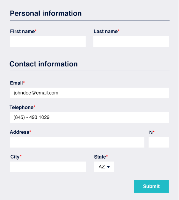
Contact information and personal information are clearly separated from one another. This helps someone create a distinction between sections, making the form easier to fill out. Avoid randomly ordering the inputs. Last name should follow the first name and not vice versa. The same way it should be name, email, and then message, rather than message, name, and email.
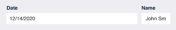
Another common layout mistake is to create inputs that are an impractical length for their value. The user should be able to tell at first glance what the label is referring to, just by the length of the input. If the length is incorrect, it can be confusing, like in the example below. The user is unable to view “John Smith” in its full length, making it impossible to see if the information has been submitted correctly. And the date is too short to require all that space. Make sure the inputs are properly laid out and proportioned by adding appropriate spacing, allowing enough space for the user to fill in information.
Mobile Friendly Forms
Most forms these days are sent using a mobile device, so it’s important for the form to be mobile friendly and avoid cluttered inputs. Imagine a form featuring multiple inputs with little to no space in between. It’d be difficult for someone to tap on an item, which can lead to an increased bounce rate. It’s the same for an overflowing form, which forces the user to horizontally scroll the page to see if information was filled in correctly. In the example below, the inputs’ height is not enough to allow an easy tap. The message text area forces the user to scroll horizontally, which makes it hard to read. Instead, consider increasing the height for mobile users.
It’s also important to stay away from hover triggered animations. Key elements (such as a label or a notice message), shouldn’t be exclusively visible on hover, since the hover events are impossible to use on touch screen devices like smartphones and tablets.
Include Relevant Labels and Placeholders
Be sure to include meaningful and clear labels. It might be tempting to get rid of them altogether and just use the placeholders, to make the form appear more slick and minimal. However, eliminating the label could cause the user to lose track of what they’re typing, and can potentially decrease the SEO of the website. Labels and placeholders are equally important elements in every form for multiple reasons.
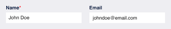
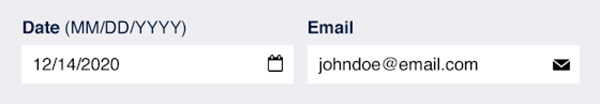
Placeholders should include examples of the inputs’ value. They help the user alleviate any doubt about the form. They can be used to display a name format (first name only? First and last name?), the address format, and more, hence why they must be included. For example, the placeholder below specifies that the name required is first and last name.
Labels and placeholders are important to display the format in which inputs should be filled. Dates are a great example of why it’s important. Should the format should be DD/MM/YYYY (European format), or MM/DD/YYYY (United States format)?

Labels need to be visible. In the example below, the label is not displayed on the left, so once the input is on focus, the user can’t see what they’re typing.
Handling Errors Properly
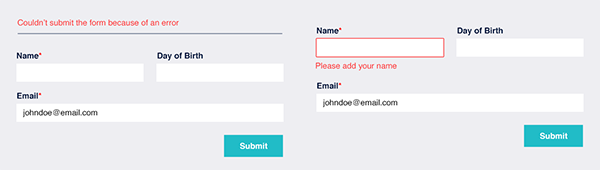
When designing an effective form, it’s imperative to remember adding easy to understand errors. Is there a missing required field? Is the email invalid? The user needs to know right away if there is a problem and why their message isn’t submitting properly. Let’s see two ways of handling errors, a wrong one and a correct one.

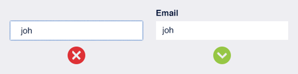
In the example on the left, the error is generic. There’s no specification about what the error is and where. This kind of error design becomes particularly problematic with long forms, because there are multiple inputs that force the user to scroll, only to find out that they have to look through the entire form again to make sure everything is filled in.
In the example on the right, the missing input is clearly marked by a red border. The error is specific, clear, and placed right underneath where it originates; the user knows what to do and where to look. It’s also important to note in the form below that color isn’t the only indication of an error. But by transforming the form to greyscale (shades of grey lacking in color), it’s still understandable that the error is generated from the specific input by the ticker border and the text, which comes in particularly handy for those with visual impairments.
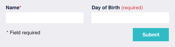
It’s also crucial to properly indicate required fields for the user. This can be done with an asterisk at the end of the field and specifying at the beginning of the forms that fields marked with an asterisk are required. Another option is to simply add “required” next to the input label, seen below.
Incorporate Meaningful CTA’s
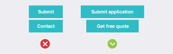
CTA’s are the focal points of the whole form, so make them count. CTA’s should be specific to the action the user is about to perform. A simple “submit” isn’t enough. Submit what? What is the user doing? Submitting a form? A job application? Let them know. In addition, CTA’s should be short and concise. A simple “submit form” is better than,“submit contact form now.”
Some designers decide to disable their buttons if the form isn’t properly completed, or if it’s incomplete. This is bad practice, as the disabled button lacks any information about the error (what is it, where is it), creating more confusion.
Use Icons
Icons can be useful tools to make even more clean inputs. It’s ok to use branded icons. Just don’t overcomplicate them, and remember that they need to be seen on every device, even the smallest ones.
Conclusion
Designing a user-friendly and visually pleasing form requires a few tricks, but it’s not impossible. Care should be taken when designing a form, since they usually represent a core element for a website (think about how important forms are for landing pages and quote requests). Imagine creating a contact form on a marketing campaign for lead generation, but it’s messy, cluttered, and very hard to use. No one will use the form, rendering the entire campaign useless.
In conclusion, here’s a summary of the best practices when designing a form.
Make sure all inputs are clear and well-defined.
Use labels and placeholders properly. You don’t have to pick one over the other!
Pay attention to the copyright. CTA’s and suggestions must be well-defined.
Don’t forget about visually impaired and screen reader users.
Verify that the form is responsive, and works on every device (avoid desktop only features like hover effects).
Avoid clutter.
That's it! Happy designing!


