


Have you ever clicked on a link and got the awful "404 Page Not Found" message? While this can be annoying, there is a way to use this frustration to draw users back to your website.
In addition to informing visitors that something went wrong, a well-designed custom 404 page points them in the direction of the content they were seeking. It's no longer a dead end but rather a useful redirection.
Let's break down why those boring, generic error pages miss the mark, and how a little creativity can make those "oops" moments way more pleasant for your visitors (and better for your website!).
Understanding 404 Error Pages
We've all seen that "404 Page Not Found" message at some point, right? It happens when you try to visit a page that's gone missing or the link's broken. Basically, it's the website's way of saying, "Uh oh, we couldn't find what you were looking for."
In the past, 404 pages were super boring – just a line of text saying the page was gone. But these days, websites are getting smarter about those error pages. A good 404 actually helps guide people back to other parts of your site instead of just leaving them hanging.
Sadly, a lot of businesses still stick with those old, unhelpful messages. It might seem weird to put effort into a page you don't want people to see, but a well-made 404 page is a secret weapon! It can make your brand seem more polished, keep people from leaving in frustration, and even turn a wrong turn into an opportunity.
The point is that even the error pages on your site are worth a little attention. A good 404 page helps visitors find their way and makes the whole experience of using your website feel a lot smoother.
The Unseen Impact of Generic 404 Error Pages
Not only are generic "Page Not Found" notifications annoying, but they're also problematic. Your brand, your users' experience, and even those crucial website statistics will suffer as a result of these lost opportunities.
Imagine that a customer is freely clicking around your site when, all of a sudden, they see that boring error message. It looks quite strange and is completely out of place on your website. The user may experience a sudden wave of confusion or, worse, begin to question the legitimacy of your website. Not only is this frustrating for the user, but it reflects poorly on your brand. Companies like Lego and Mailchimp understand this, turning potential dead-ends into playful and helpful experiences with their custom 404 pages.
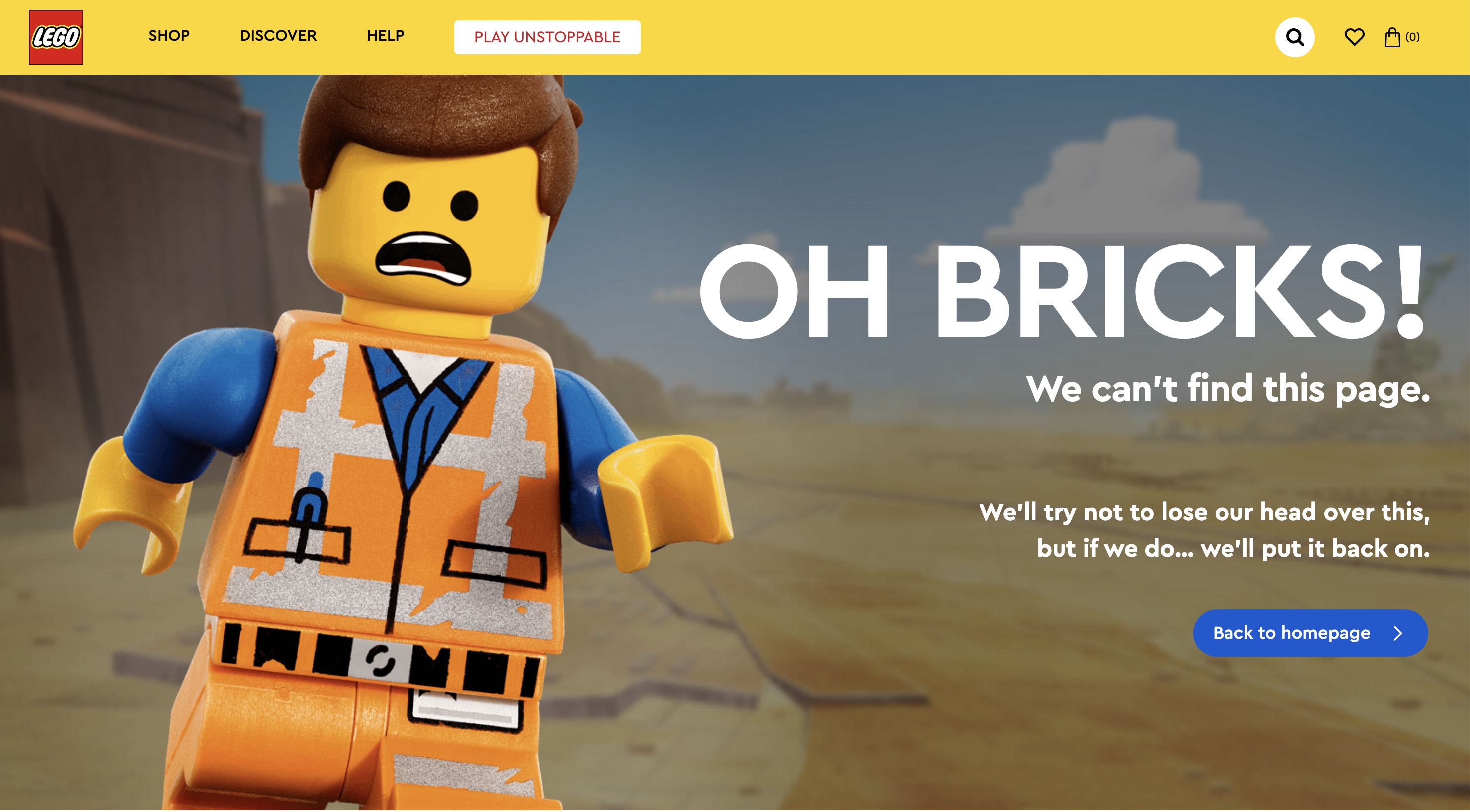
Lego: Their 404 page features a fun animation of a Lego minifigure looking confused and disassembling itself. The message "Oh Bricks! We Can't Find This Page" is playful and on-brand. They also include a helpful link to the homepage.
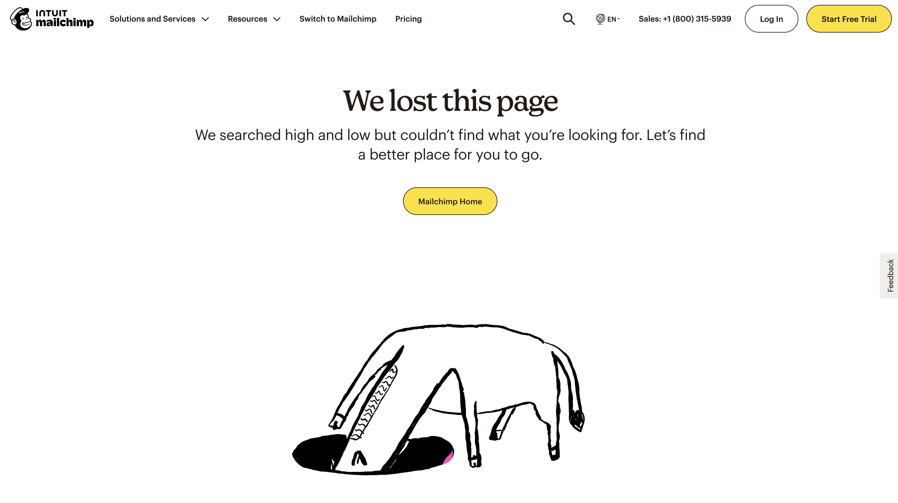
Mailchimp: Mailchimp uses their signature quirky humor with a message like "We lost this page. We searched high and low but couldn't find what you're looking for. Let's find a better place for you to go." Their 404 page features an animated horse graphic searching in hole in the ground and offers a helpful link to the homepage.
The good news is that there is an alternative to these error pages! Crafting a good 404 page makes it an extension of your brand, whether it's funny, useful, or just right for your style. It's another chance to show people what your site is about and keep them interested.
Custom 404 Error Pages
Because the internet is so vast, it is inevitable that occasionally users will see blank pages. At this point, a professionally created 404 page comes to the rescue! Custom 404 pages are better than boring error messages because they let you connect with the user.
Your 404 page shouldn't feel like it was tacked on at the last minute. It needs to fit seamlessly with the rest of your website's design. This is your chance to show that you care about the user experience design and to let your brand personality shine through. A generic error message totally disrupts the vibe you've worked hard to create, but a 404 page that matches your style keeps everything flowing.
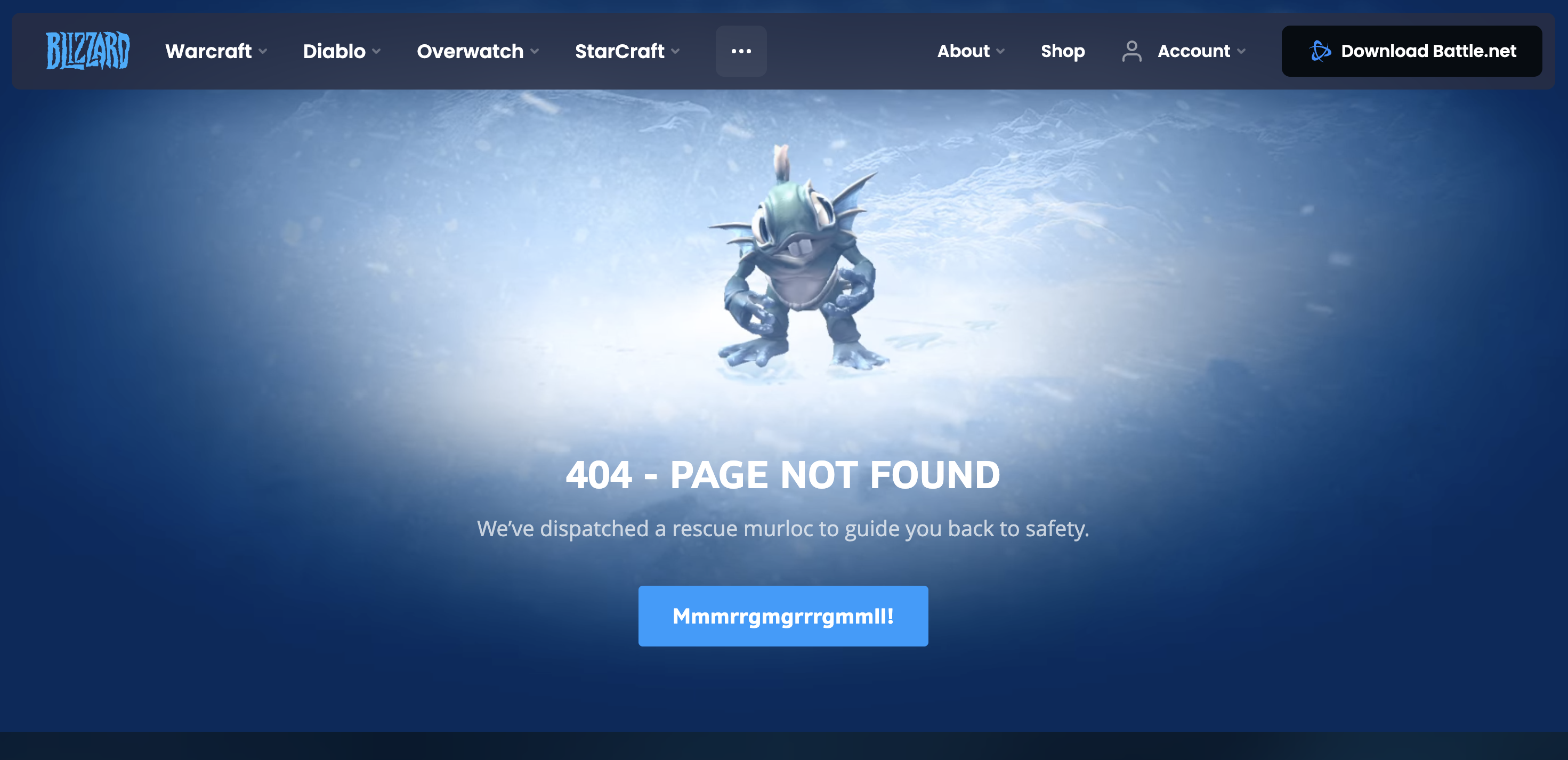
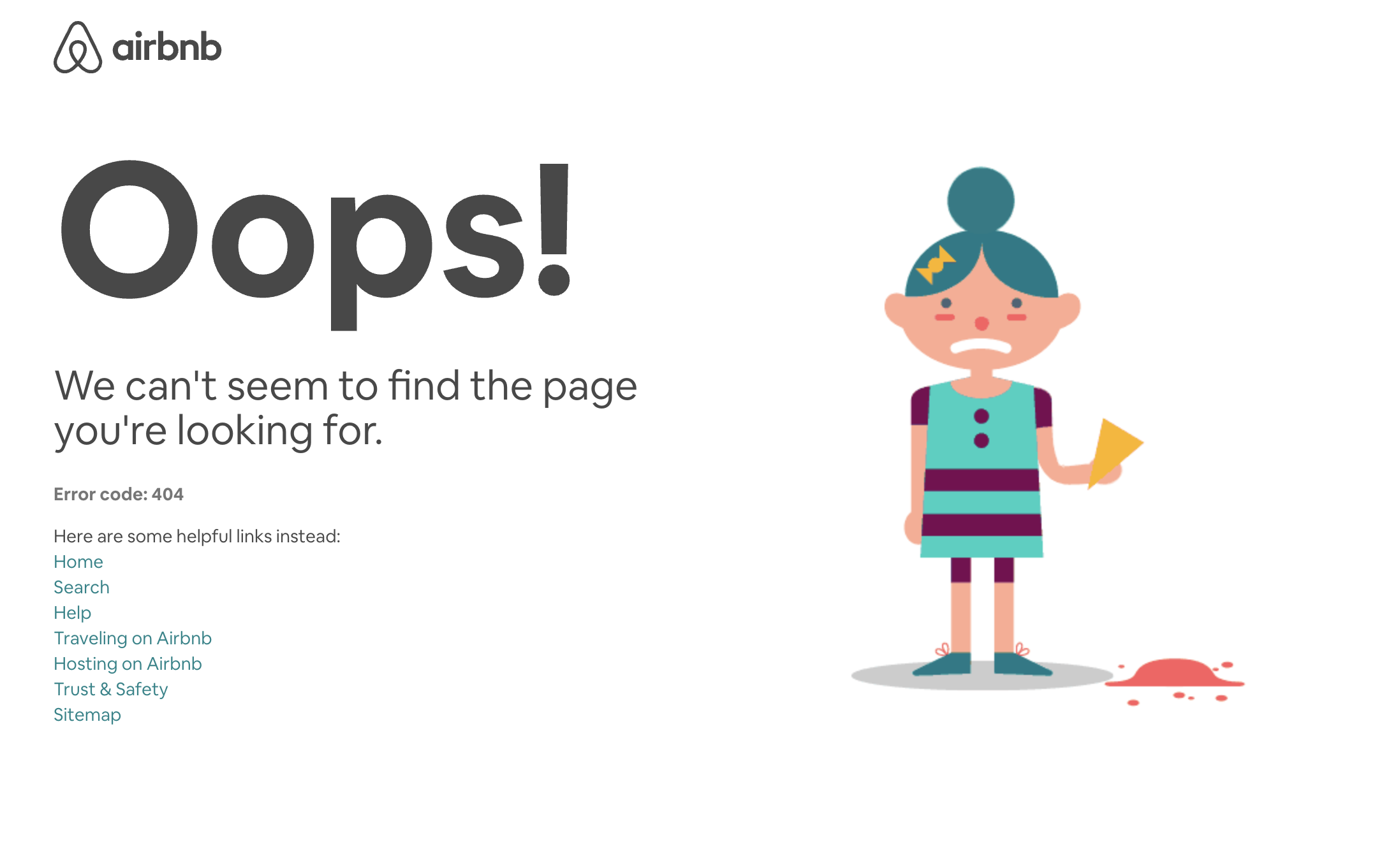
The best 404 pages go beyond just saying, "Oops!" Think of Blizzard Entertainment's page featuring characters from their video games or Airbnb's minimalist approach with a focus on usability. These examples show how to keep visitors engaged even when they take a wrong turn. They help people find what they need. A little cleverness, the right tone (funny, helpful, whatever fits your brand), and some clear links back to the rest of your site make it way more likely that people will stick around.
Blizzard Entertainment: Blizzard, known for its video games, has 404 pages featuring characters from their popular titles. The message is simple yet effective: "404 - PAGE NOT FOUND. We've dispatched a rescue Murloc to guide you back to safety." They offer a helpful link to the homepage labeled "Mmmrrgmgrrrgmmll!".
Airbnb: Airbnb takes a minimalist approach, with a simple "Oops!" and an animated graphic of a person spilling their ice cream. They keep it functional, with search and navigation options at the forefront.
Get creative, and your 404 page can even be a bit of a surprise! Turn that wrong click into an opportunity for people to explore your site. The whole point is to keep visitors interested, make the experience less frustrating, and make sure even those accidental visits turn into something positive.
Key Elements of an Effective Custom 404 Page
Okay, so you have a custom 404 page – awesome! But it needs to actually work for your visitors. Here's the checklist for making it a success:
Be yourself: This is an error page, but it's still part of your brand! Don't be afraid to use the same style, humor, etc., that makes your website unique.
Keep it simple: No one wants to read a bunch of confusing tech-speak when they're already lost. A simple "Whoops, looks like this page went missing" is way more helpful.
Give them options: The whole point is to keep people on your site, so give them clear ways to get back to the good stuff! A search bar, links to popular pages, or even just a big "Home" button goes a long way.
Make it interesting: A little design effort can make a frustrating error into a fun moment. Lego does this brilliantly with a playful graphic of their signature minifigure on their 404 page. Mailchimp uses their brand's quirky humor, while Blizzard's page stays true to their gaming roots. Don't be afraid to use an eye-catching image, a funny message, or something that makes people smile.
The bottom line is that your 404 page is all about making the best of a little hiccup. By keeping it on-brand, focusing on clear communication, and adding some personality, you can turn those "oops" moments into a chance to impress visitors and keep them exploring.
The Role of Custom 404 Pages in Visitor Retention
A good 404 page doesn't just make your website feel smoother, it's a powerful tool to keep people from leaving! Think of it this way: someone encounters a broken link, and normally, they'd be out the door. But with the right 404 page, you can turn that around and keep them engaged with your site.
How does it work? It's all about being helpful and staying on brand. Instead of a confusing error message, give visitors clear options to find what they need – a search bar, links to popular pages, or a simple way to get back to the homepage. Add a bit of your brand's personality (friendly, funny, etc.), and suddenly a frustrating moment becomes a positive one.
This approach also tells visitors that you care about their experience, even when things don't go perfectly. That kind of reliability makes people more likely to explore further instead of giving up.
The bottom line is that a custom 404 page is an investment in website visitor retention. Done well, it's a way to turn those "oops!" moments into opportunities to show off what makes your website great.
For More 404 Design Inspiration, Check Out the Following
Creating a remarkable custom 404 error page is just a few steps away. Let's bypass the usual dull error pages by getting inspiration from cleverly designed versions. These pages not only catch the eye, but they also guide users back to important parts of the site. Here are a few examples:
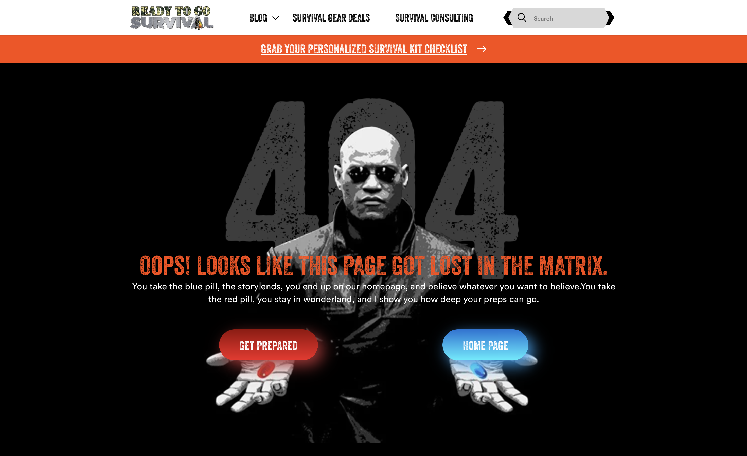
Ready to Go Survival -
Ready To Go Survival tackles the dreaded 404 error with a dose of humor and a helpful twist. Their message, "Oops! LOOKS LIKE THIS PAGE GOT LOST IN THE MATRIX," is a clever nod to the iconic film. It adds a lighthearted touch to an otherwise frustrating situation. Visitors aren't left stranded, though. Two clear options, "Get Prepared" and "Home Page," offer easy ways to get back on track with their survival kit browsing. This simple design helps make errors less jarring and keeps users engaged with the site.
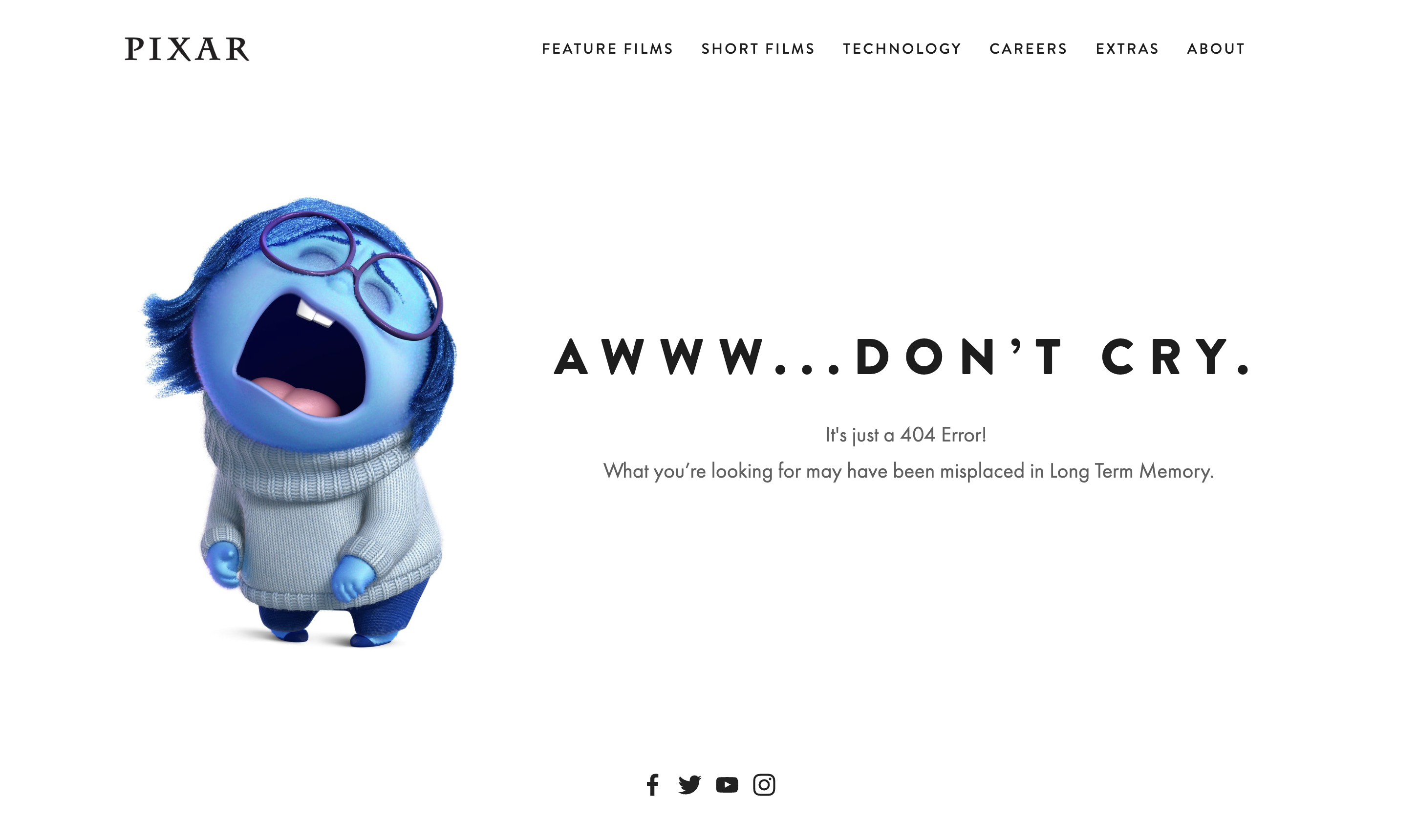
Pixar -
Pixar's 404 page is known for its creativity and adds a pinch of humor to a usually frustrating situation. The page features Sadness, a character from their movie Inside Out, adding a chuckle to an annoying situation of reaching a dead link. Users can swiftly return back to the primary site using the menu available on the page top. This smart design not only helps maintain the brand's identity but also makes the experience of landing on a 404 page less irritating.
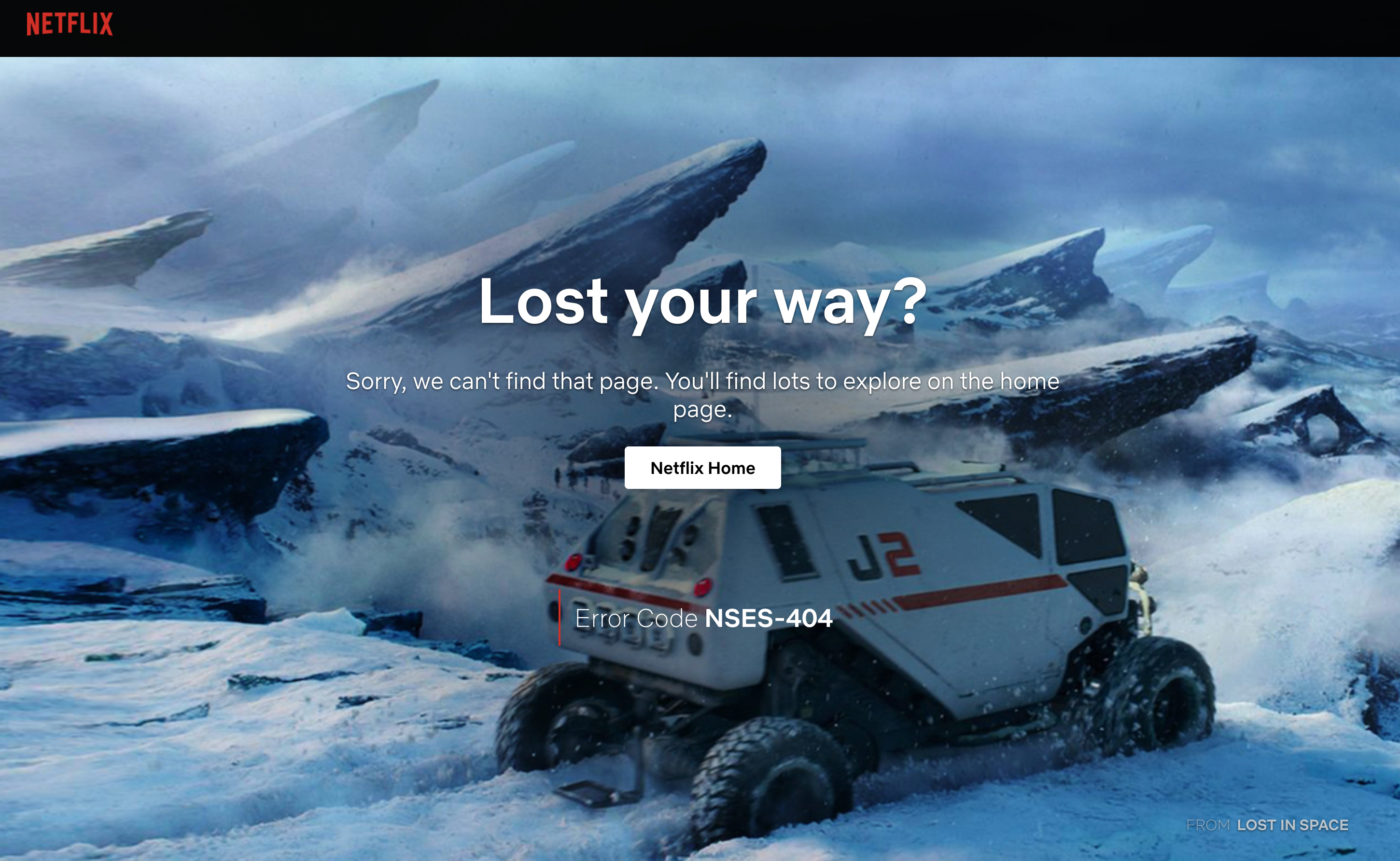
Netflix -
Netflix makes their 404 error page both helpful and entertaining by using a clever graphic from their popular series, Lost in Space. The funny line "Lost your way?" adds a lighthearted spin. Users can be directed back to the homepage to continue looking for their top movies or TV shows with the help of a big "Netflix Home" button in the center of the page. This key feature helps to enhance user experience during errors. This Netflix example demonstrates its successful use.
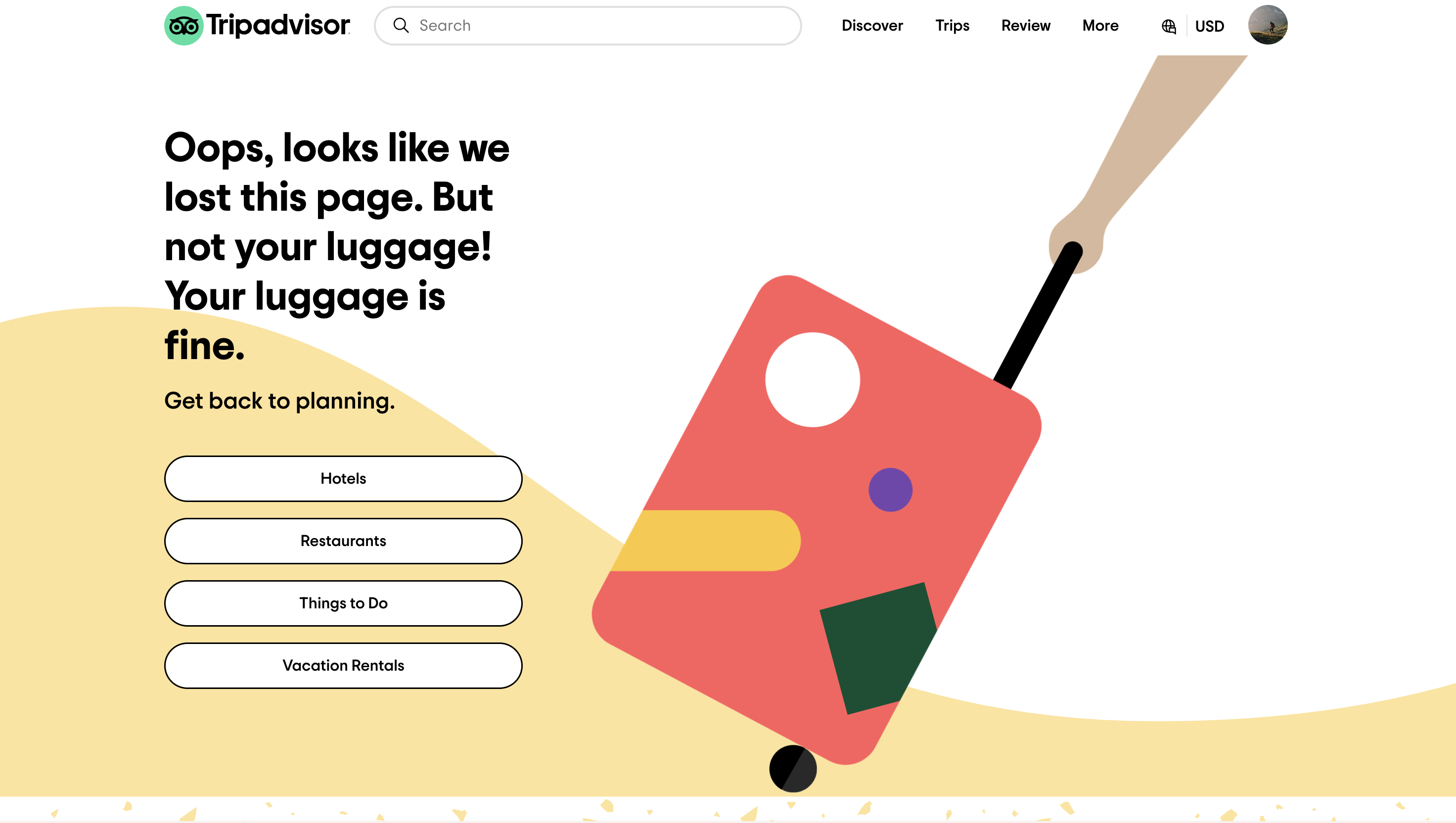
Trip Advisor -
Tripadvisor has a creative 404 page. It amusingly suggests the page, not your bags, is lost. This coincides with their travel theme. The call-to-actions direct users to four key areas on their website: Hotels, Restaurants, Things to do, and Vacation rentals. This cleverly re-engages the user and assists with planning their upcoming vacation.
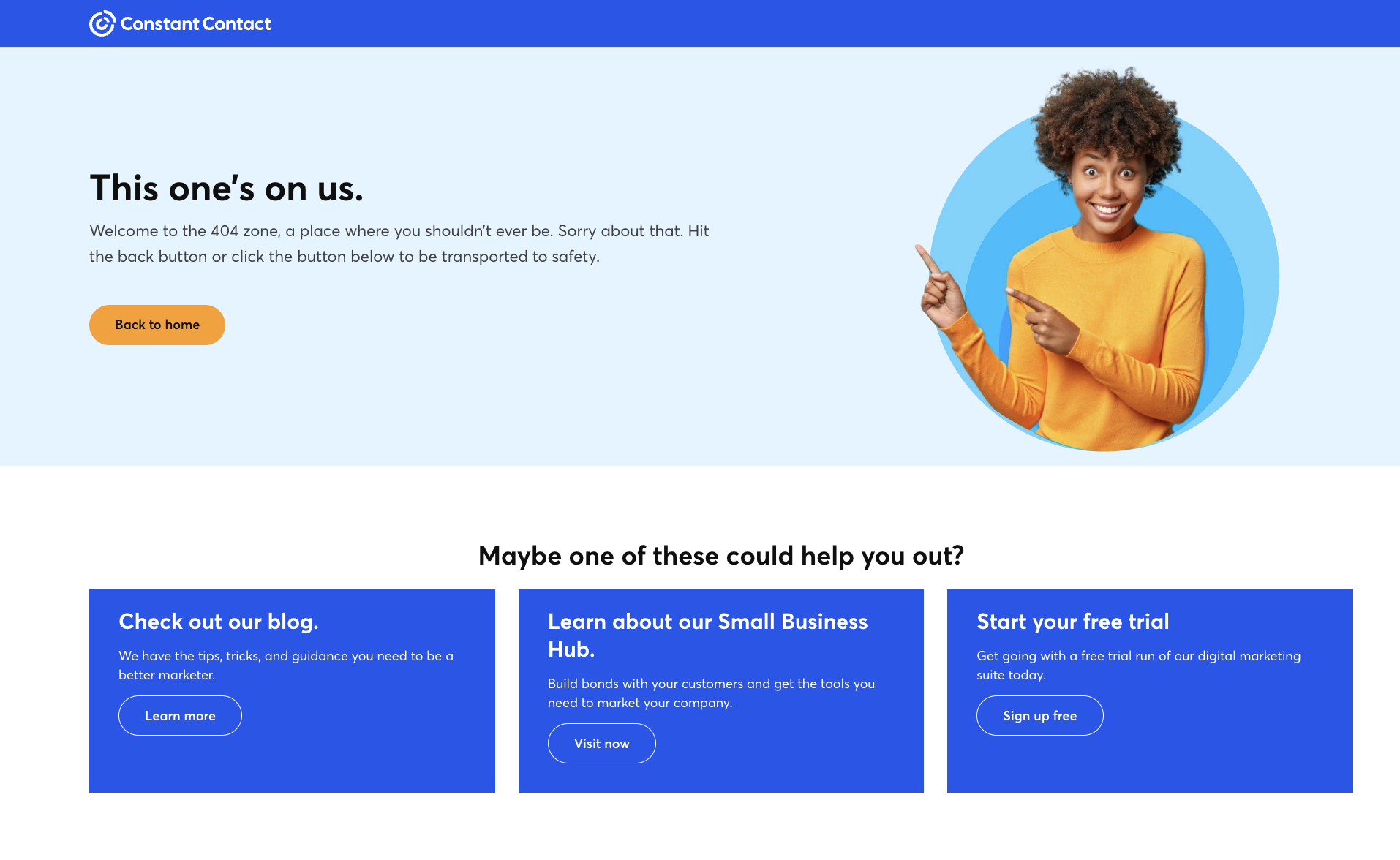
Constant Contact -
Constant Contact uses an easy-to-understand language on their 404 page: "This one's on us.
Welcome to the 404 zone, a place where you shouldn't ever be. Sorry about that. Hit the back button or click the button below to be transported to safety." They also offer a quick path back to the homepage. Additionally, they suggest, "Perhaps these links might be useful?" which leads to other parts of the site, assisting users to find what they need.
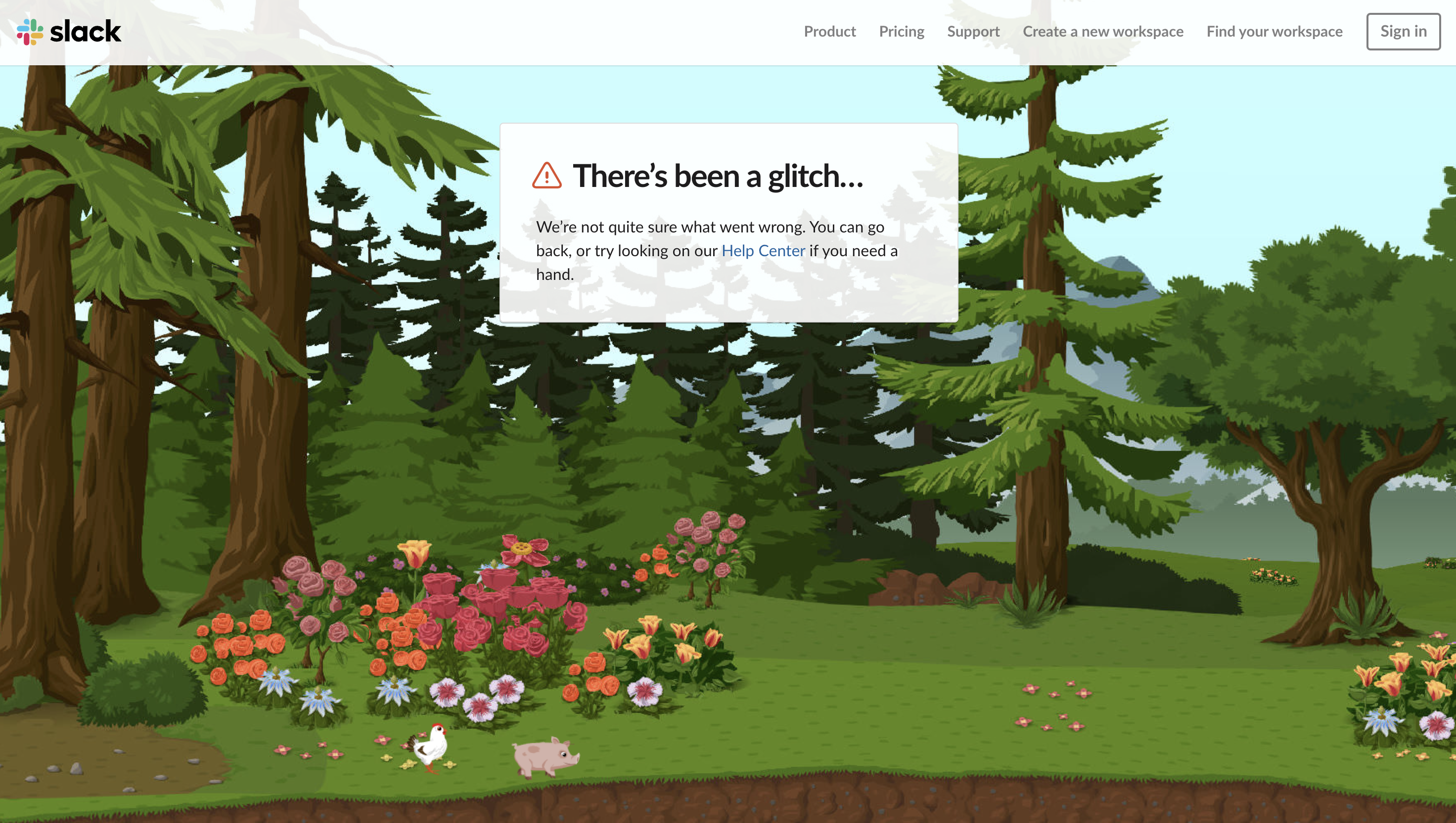
Slack -
Slack's 404 error page has an eye-catching, animated background to keep users interested. While there's a link to the Help Center, a direct link to the homepage is missing. However, there is a useful footer menu with multiple links, helping users locate their desired page.
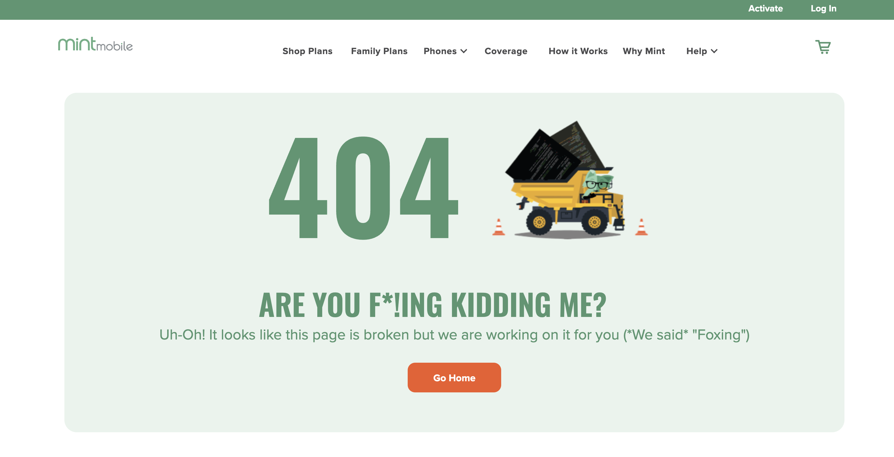
Mint Mobile -
Mint Mobile, a well-known online telecom company, uses a custom 404 error page to improve its website's user experience. Instead of showing a standard error message when a user encounters a moved or non-existent page, Mint Mobile displays a 404 page with a funny, brand-related message saying "404. ARE YOU F*!ING KIDDING ME? Uh-Oh! It looks like this page is broken, but we are working on it for you (*We said* "Foxing")"
Email Center UK -
Email Center UK (presently a division of Xtremepush) deployed a unique 404 page. Though this page no longer exists, it is worth mentioning. They took the error's blame onto themselves, giving audiences a creative way to deal with 404 hitches. Their approach doesn't fault the user for the issue. They adopt a respectful and apologetic tone.
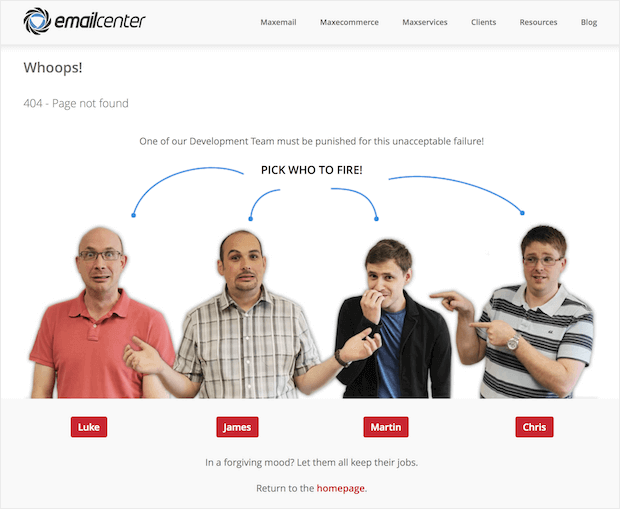
They transformed their page into an engaging game. Here, visitors can pick a developer to blame for the 404 error. On selecting, they are directed to a second page as follows:
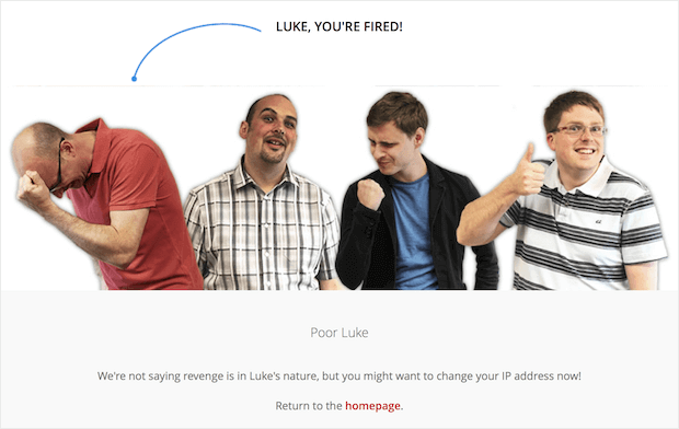
Such a technique makes your 404 page an intriguing game that enhances both user engagement and experience.
These examples demonstrate that your 404 error page doesn't have to signify the end of a user's journey on your site. Instead, it can be turned into another opportunity to engage, reflect your brand's voice, and even extend your narrative. Get creative and use illustrations, humor, games, or any approach that suits your brand's personality. Always facilitate user navigation back to your site's relevant pages. Who knows? This moment of error could turn into a moment of exploration and engagement for your visitors.
Why Your Website Needs A Custom 404 Page
A custom 404 page does more than fix errors – it enriches your website's user experience. It transforms an unpleasant error message into a friendly, brand-consistent reminder that navigational mishaps can occur. And hey, it's a great spot to sprinkle some humor, too!
View it as an opportunity - your 404 page converts a potential disappointment into a fun interaction with your visitors. You can use it to showcase your brand's essence and ensure even inadvertent clicks lead to enjoyable exchanges. It's good for the visitor and great for user retention.
At Curious Minds Media, we can assist in designing and developing engaging, easy-to-use 404 error pages that align seamlessly with your brand identity. We believe it's crucial to maintain consistency in style and tone across your entire website, including your error page.
Think of it like this: your 404 page turns an "uh-oh" moment into a chance to connect with visitors. You get to show off your brand's personality and make sure even those accidental clicks turn into something fun and helpful. That's a win for them and a win for keeping people happy on your site!